Belvoir
With @bandbstudio
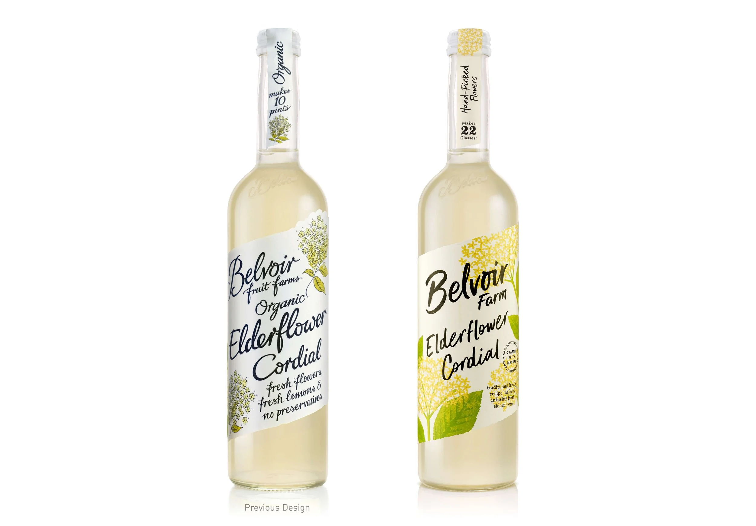
B&B worked on the redesign of Belvoir, aimed at growing the brand, with more consumer engagement and to appeal to a younger audience. Whilst they were working on these beautiful strong colours + wild new illustrations, I helped them craft the new Belvoir logo type, developed from the original, making it much more natural + modern.
Images credited to B&B Studio 🤍
“Belvoir’s new graphic identity and packaging design seeks to sensitively evolve the key assets from the existing and hugely recognisable design – including its handwritten type, angled label and ingredient illustrations – in a new, more wild, direction. The type, including the brand logotype crafted by Rachel Joy Price, becomes less ornate and calligraphic for a more natural and contemporary feel, while the illustrations are not so carefully placed in the layout but are instead allowed to grow into the design from the side as they would in nature.”


